City of Rexburg
UX research & Interface
This was a group project that was conducted over the span of 12 weeks, and user research played a crucial role throughout the entire process. The team utilized various research methods such as surveys, interviews, and usability testing to collect data and feedback from the target audience. This helped the team to gain a deeper understanding of the users' needs and pain points, which then informed the design decisions and iterations made to the website.
Overall, the project's success was largely due to the emphasis placed on user research, which ensured that the end product was tailored to the needs and preferences of the users.
View the final prototype here: City of Rexburg UI
The original design of the City of Rexburg’s website is here on the left. As you can see it is very cluttered, the colors are dark and compete for attention on the page. If you were to visit the site you would see the menus are also very cluttered. There are many broken and repeated links. We made the assumption that users would have a hard time finding the main things they would need.
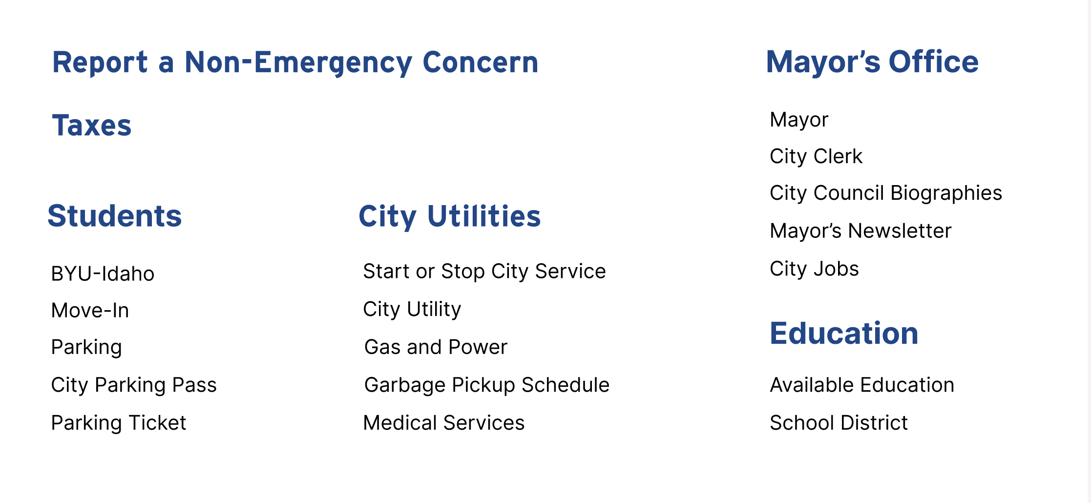
After conducting our research, we went through and organized all of the information on Rexburg’s page. We got rid of broken links and renamed the working links to make more sense for their function. After that we decided we would rework the headers on the home page. We found that once we got rid of repeating information, there was much less clutter.
We conducted user interviews and user tests with students at our school. We asked them what they found to be difficult and asked them to complete a set of tasks. After organizing our research we created user personas aiming to combine the biggest concerns of the students
The final Interface came together to be something we were all proud of. We had the opportunity to present it to the City of Rexburg in person and they seemed very pleased with our work. They requested our research and interface to hopefully implement some of our ideas.
Finally I went through and remade all of the menus with our new links and organization. I increased the spacing and created the menus to be the same width across with varying lengths. Along with that we implemented our ideas to make the website more accessible to BYUI Students. We decided that putting a BYUI slide in the main slideshow would allow student to access their resources easier. We also thought that the community calendar and news being improved would allow students to be more active in the community.


